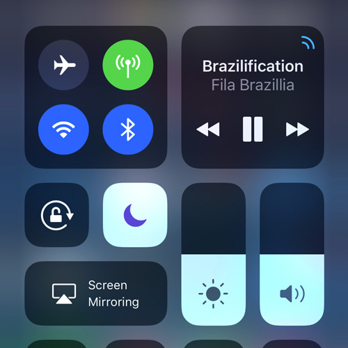
After a couple of days using the iPhone X, I love it. But my biggest concern –prior to, and now after extensive use– is how awkward it is to invoke the Control Centre.
Obviously the traditional swipe up from the bottom gesture has been replaced to allow navigation to the Home Screen & App Switcher. Moving the Control Centre gesture so far away from reach makes for a compromised user experience for such a critical feature.
One handed access to the Control Centre is now only possible using Reachability. While useful in essence, it’s incredibly unintuitive for this purpose –and crucially– often a hit and miss affair, quite literally. Nb. Reachability isn’t an option while on the unlock screen.
-

iOS Control Centre -

3D Touch -

Bottom Edge Bar
Accessing the Home Screen and App Switcher is great on the iPhone X. So much easier and more fluid than using a physical Home button.
The Control Centre is something I use so often, this is becoming a real issue for my overall satisfaction with the device. There needs to be a better solution…
A suggested solution
I’d suggest offering an optional setting to allow a 3D Touch press on the bottom edge bar to invoke the Control Centre rapidly.
In addition to the critical gestures, the bottom edge bar also allows switching open apps by swiping left / right. This is a smart new UI feature on the iPhone X.
Invoking the Control Centre by swiping from the top right of the screen is a compromise too far. Adding a 3D Touch gesture to the mix would work extremely well, adding to the useful functionality of the bottom edge bar.
I’ve suggested this to Apple via their feedback form today and really hope they’ll consider it.
Do you agree?
SUBSCRIBE FOR FRESH CONTENT
Follow me on social media for updates.

I absolutely agree! I think it’s pretty weird that they invented 3D touch (the right click of the touch screen) and they haven’t implemented it in any significantly useful manner. This seems like an obvious way to take advantage of the feature and give an example to developers how they can more intelligently utilize 3D touch.