I’ve just completed some work to realign my brand Jaybee Productions and redesign areas of this website. Here’s a few words on the thinking and process.
Brand Ident
Beginning with the ident, I’ve decided to remove the encasing pentagram, resulting in the solid white Jb™ script mark.
I’ve been using this script mark on photo watermarks for a while and feel the bolder appearance is more aesthetically pleasing.
The addition of the trademark symbol (UK) and Jaybee Productions wordmark pairings, aims to strengthen my brand proposition which I am continuing to push forward with this year.
-

Previous mark -
Refreshed mark -
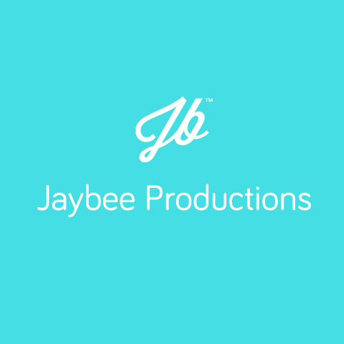
Wordmark pairing
Website Homepage
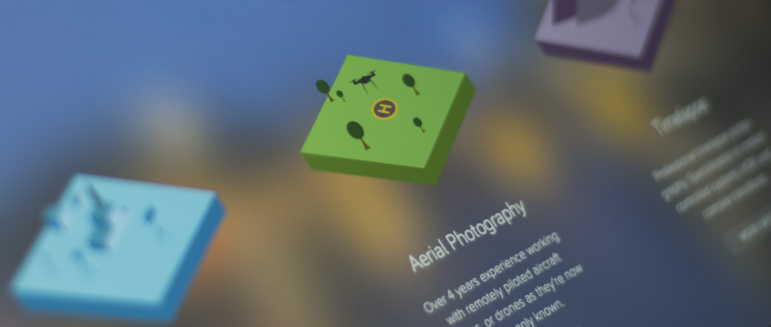
I’ve redesigned this website’s homepage with a single goal in mind: to quickly draw focus to my main service areas; Filmmaking, Aerial Photography, and Timelapse.
The previous homepage cycled though these areas over around 10 seconds, each using; fullscreen photography, strap lines, and x2 call-to-action buttons. Ultimately this would result an undesirable outcome: for a user to potentially be forced to watch this cycle play out, then be faced with a choice of one x6 call-to-action buttons (when on-screen).
Clearly this was too arbitrary, complex, haphazard, and clunky for a main landing page.
So, the motivation behind this redesign was to remove this complexity and provide an easy-to-digest initial outlook to my overall proposition, inviting a user to dig a little deeper.
-
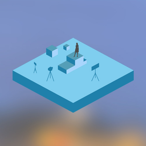
Filmmaking -
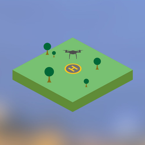
Aerial -
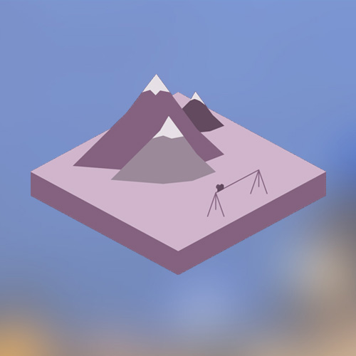
Timelapse
I designed three simple little ‘worlds’ to represent each of the core areas, opting to present these as uniformly shaped isolmetric’ish graphical plateaus. Each uses a three-way colour system and features an animated sprite element to draw attention.
The graphics were designed in Illustrator, animated in After Effects, then converted into GIFs. I experimented with APNG (animated PNG’s) for a while, but progress was halted by unstable iOS behaviour, resulting in page crashes.
With some work, the differences between (the more desirable) APNGs and GIFs are only apparent if you zoom into the GIFs animations (mainly dithering artefacts on the sharp back edges).
As previously, the large ‘contact’ footer remains throughout the website, providing quick and easy access for getting in touch.
Blog Lander
The blog landing page needed work. Previously this was presented in a similar fashion to a post page (such as the one you are reading), i.e, on the desktop layout, a long list of posts on the left coupled with an equally long sidebar (which was really designed just for use on post pages).
The idea behind this section’s refresh was to provide a wider overview of posts, more of a dynamic ‘spread’ as opposed to an uninspiring list.
This new layout includes areas highlighting Featured and Roundup posts and is arranged using a grid eliminating the sidebar. The mobile layout uses a new 2×2 grid for these sections, a more compact arrangement to ease scrolling.
Two useful sidebar items were retained for inclusion; Recent Work; and Signup, with the addition of a new Micro Blog area.
Archive posts are available lower down the page in smaller units. These are hidden from the mobile layout, to reduce clutter and excess scrolling on smaller devices.
Other Bits
Aside from some minor UI tweaks, the inner service pages are pretty much untouched, as I feel these still serve the content well.
I made numerous tweaks to the overall site, all documented here if interested. Dynamic websites constantly require iteration, no doubt I’ll be addressing other things going forward.
Hope this was a useful insight for someone. I think it’s a good exercise to continually review your work and to describe the thinking behind design decisions.
SUBSCRIBE FOR FRESH CONTENT
Follow me on social media for updates.